OOH works best when it leaves you wondering
Rowan Gillette-Fussell, Senior Planner
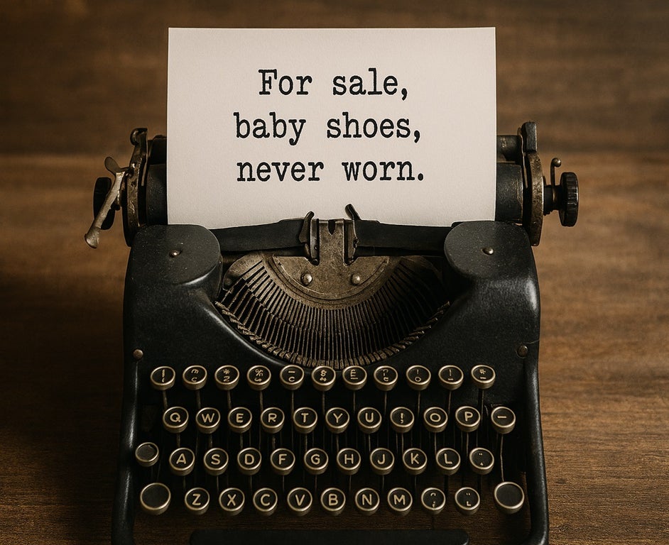
Ernest Hemingway’s six-word story remains one of the most effective examples of streamlined storytelling. With barely a sentence, it conjures a world of emotion, intrigue and unanswered questions — the kind of impact most marketers dream of.
It’s a masterclass in saying more with less — and it’s a lesson that applies far beyond literature. Nowhere is this more evident than in the world of film posters. Long before trailers, posters had one job: to stop us in our tracks and make us feel something. In a single frame, they had to sell a story, spark emotion, and convince you to leave the house.
In advertising, we often talk about storytelling as the holy grail — the key to emotional connection and long-term brand building. Yet, out of home (OOH) is still too often seen as a medium that’s great for visibility but not for narrative. It’s as if we’ve decided that storytelling only belongs to other mediums such as AV or social.
That’s a mistake, because when it’s done well, OOH can deliver some of the most memorable, story-rich creative in the marketing world. Think of the global “Shot on iPhone” campaign — millions of stories told through a single line and a user’s photo. Or Spotify’s “Thanks, 2016. It’s been weird.” billboards — storytelling through data, humour, and cultural reflection. Or McDonalds utilising their arch to guide people to nearby stores.
These examples prove that OOH isn’t the antithesis of storytelling — it’s just a different kind of storytelling. And it’s one we can learn a lot about by looking at how movie posters do it. Here are a few lessons worth stealing:
1. Colour is Emotion
Horror? Deep reds, shadowed blacks. Action? High contrast brights that scream urgency. Comedies often use warmer palettes that signal optimism. In film, these choices echo the cinematography and set the tone instantly. In OOH, colour can do the same — priming the viewer’s emotional response before they’ve read a single word.
2. Composition Guides the Story
Like photography, posters use composition to lead the eye:
- Rule of thirds: Placing subjects at intersections creates balance and intrigue (Everything Everywhere All at Once)
- Leading lines: Using architecture, text or objects to point to the hero (Metropolis)
OOH benefits from the same discipline. Think about what you want people to notice, is it a logo? Is it a product? Is it a QR code? Design copy effectively to what you want your audience to take away.
3. Minimalism vs Maximalism
Some posters, like The Social Network teaser, thrive on restraint: sparse copy, a single face, a line of intrigue. Others, like Avengers, succeed by filling the frame with controlled chaos. The choice in OOH should be deliberate:
- Minimalism signals confidence and focus. One dominant image — uncluttered and intentional — can become the campaign. Sometimes, less is what makes people lean in
- Maximalism works when scale and spectacle are the selling points
4. Consistency Builds Worlds
Franchises like Marvel and Star Wars make every poster a recognisable chapter in a bigger visual story. OOH campaigns should do the same — Use consistent visual language across campaigns to reinforce brand identity. Consider building assets or iconography that become recognisable over time. Treat each poster like a chapter in a visual story, rather than a standalone ad.
5. Cultural and Local Relevance Makes It Stick
Movie posters are often adapted for different regions. OOH can go further — customising creative for specific formats & environments, see the sinking billboard for Day After Tomorrow placed in the Pacific Ocean. Use cultural references, real-time data, or location-specific hooks to make the message feel personal.
6. Copy Should Work Like a Tagline
Movie taglines are masters of economy: “In space, no one can hear you scream.” Barbie’s “She’s everything. He’s just Ken.” — a five-word tagline that helped propel the film to become the highest grossing of 2023. These lines tease without telling. OOH copy should do the same — short, sharp, and full of voice.
7. Don’t Tell Everything — Tease Just Enough
Some of the most iconic posters are teaser posters: no actors, no full titles — just a date, a symbol, or a single word. Jaws gave us a lone swimmer above a lurking shark. E.T. showed a bike silhouette crossing the moon. A single frame that tells you everything you need to feel.
OOH Deserves Bigger Creative Ambition
The art of storytelling isn’t always around the campfire. Sometimes it’s a frame, a symbol, a line of copy on a billboard. The best OOH doesn’t try to tell the whole story — it sparks enough curiosity for the audience to write the rest themselves.
Film posters have been turning heads and telling stories for over a century. They know how to build a world with a single glance. If we want our OOH campaigns to last longer in people’s memories, maybe it’s time we stopped thinking like advertisers — and started thinking like filmmakers.
After all, the best stories don’t need two hours. Sometimes, they just need six words — and the right billboard.